Paykickstart
NaN
Web Design

The Problem
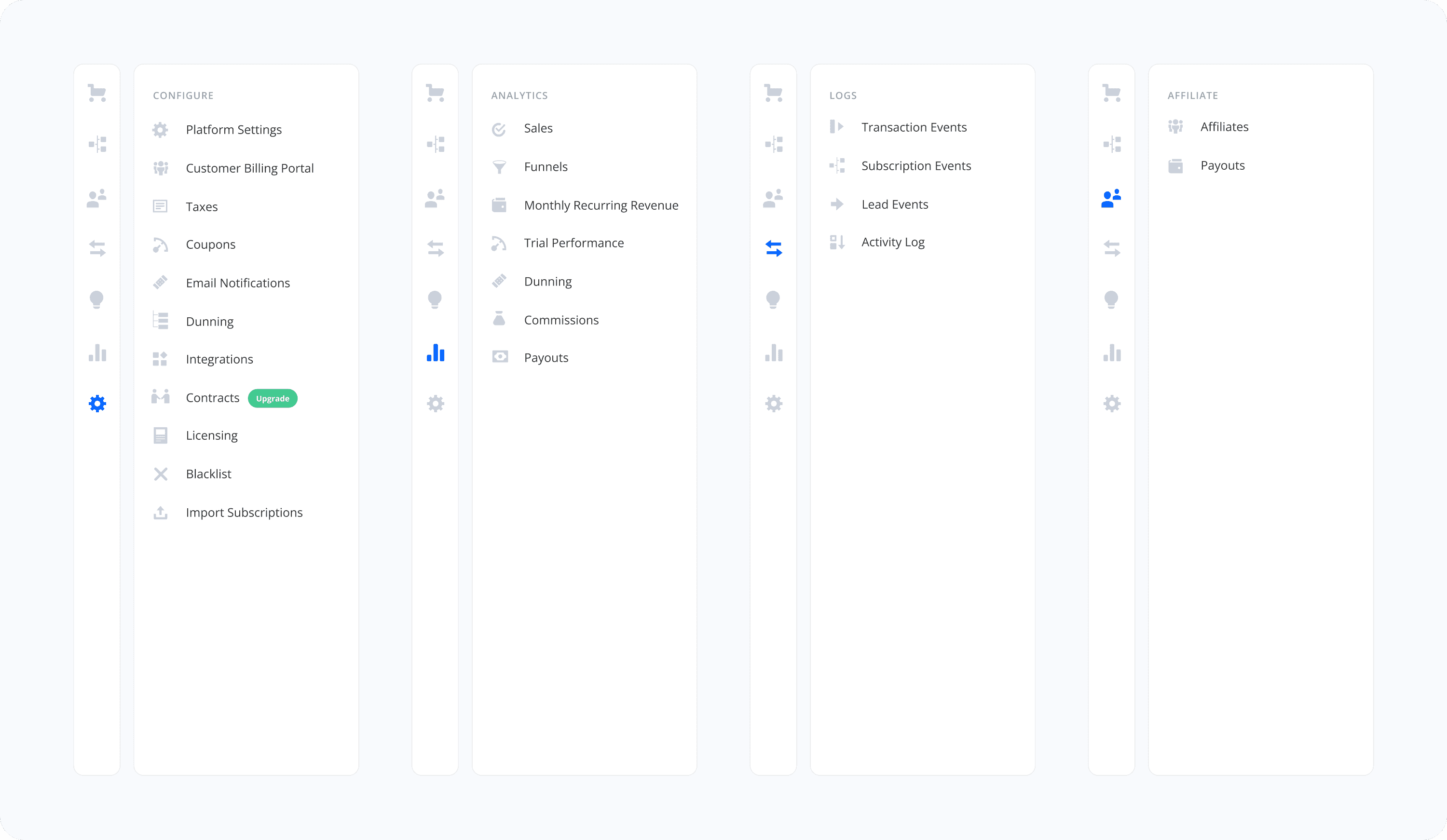
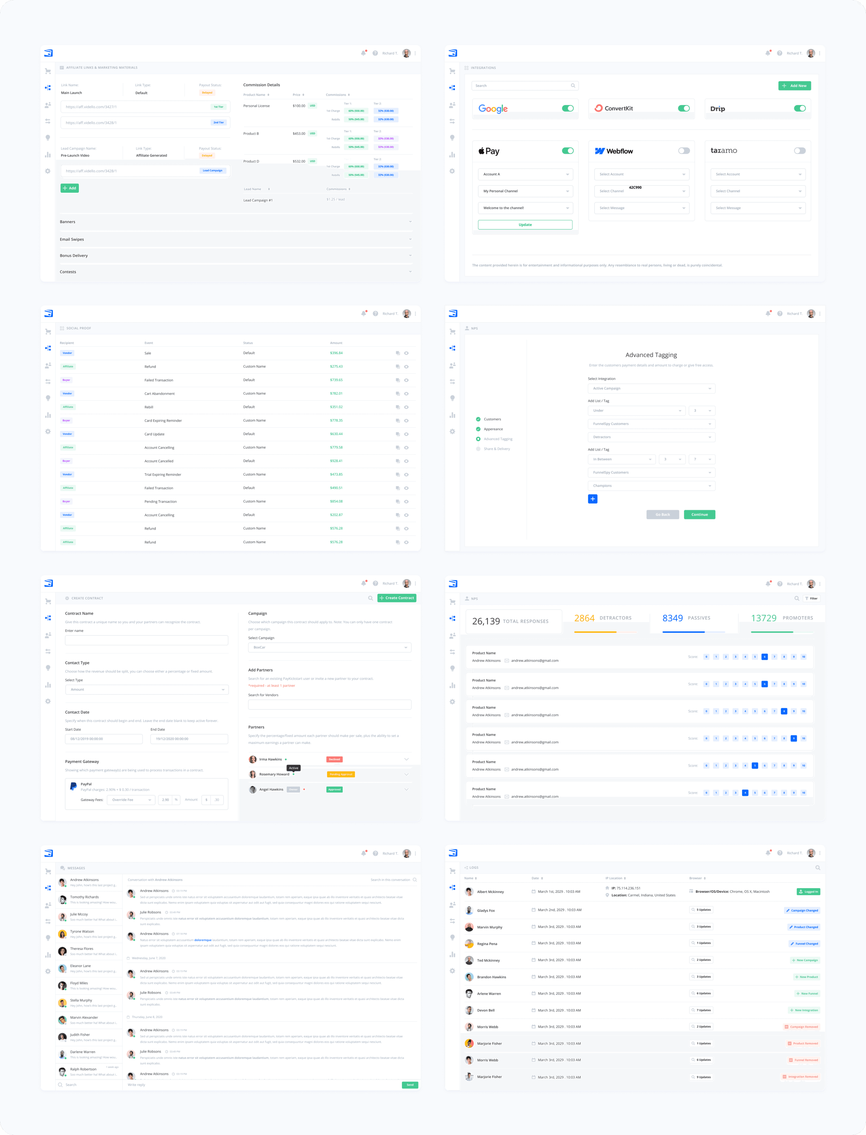
PayKickstart, a platform for subscription billing and affiliate management, had an outdated, cluttered UI spread across more than 100 screens. The complexity and confusing user flows led to frustration and poor engagement. Their website faced similar issues, with a disorganized structure that hampered conversions.

The Approach
The project began with a research and brainstorming phase to decide the plan of action.
We then embarked on simplifying the user experience across the web app’s 100+ screens, streamlining UX workflows and reducing visual clutter. Key actions like subscription management and affiliate tracking were redesigned to be more intuitive, ensuring that users could complete tasks with fewer steps and less confusion.
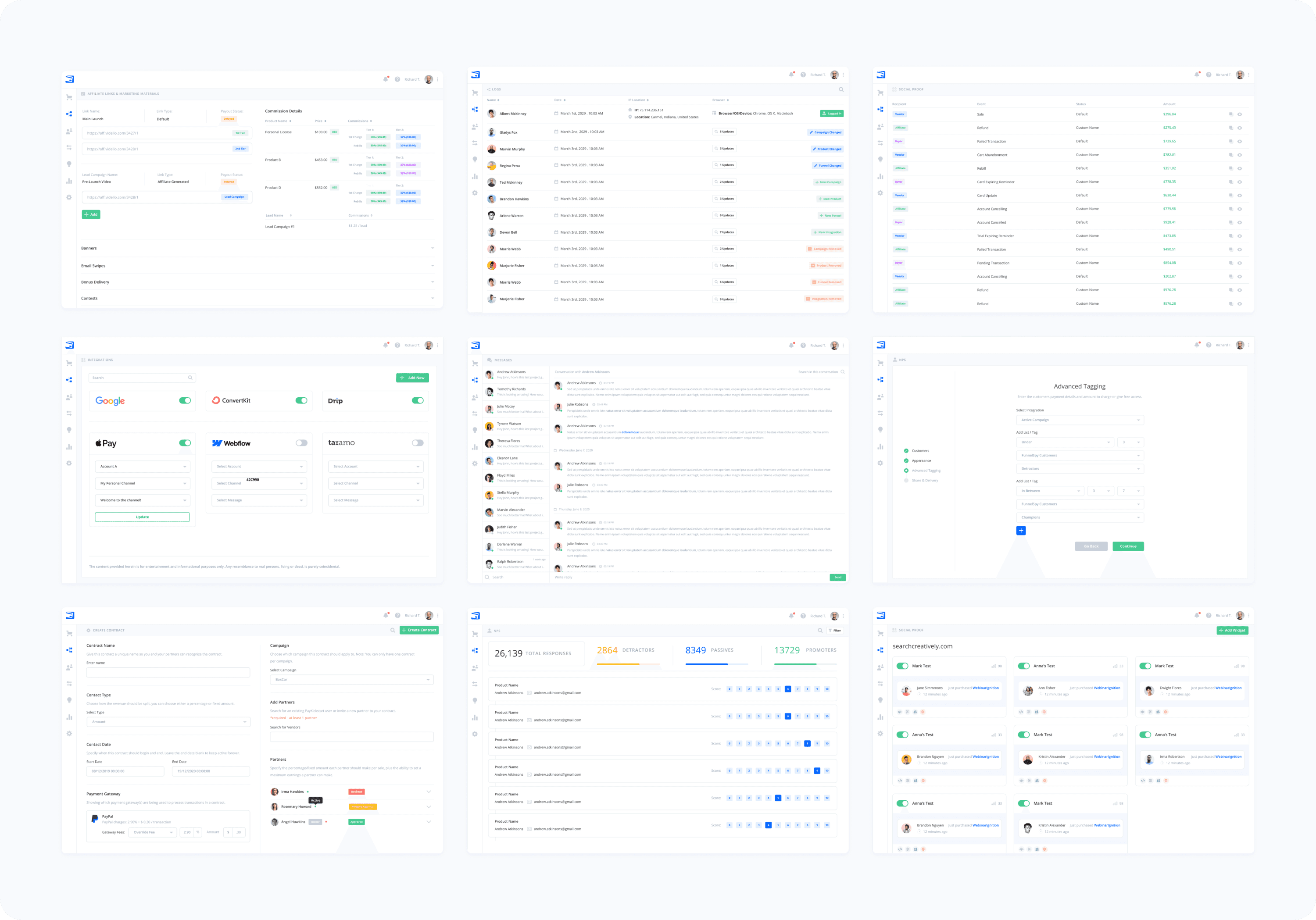
On the visual side, we introduced a modern, minimalist design system that embraced white space and a cleaner, more vibrant aesthetic. This not only made the interface easier to navigate but also brought PayKickstart in line with modern SaaS standards. The result was a platform that looked and felt much more professional and user-friendly.
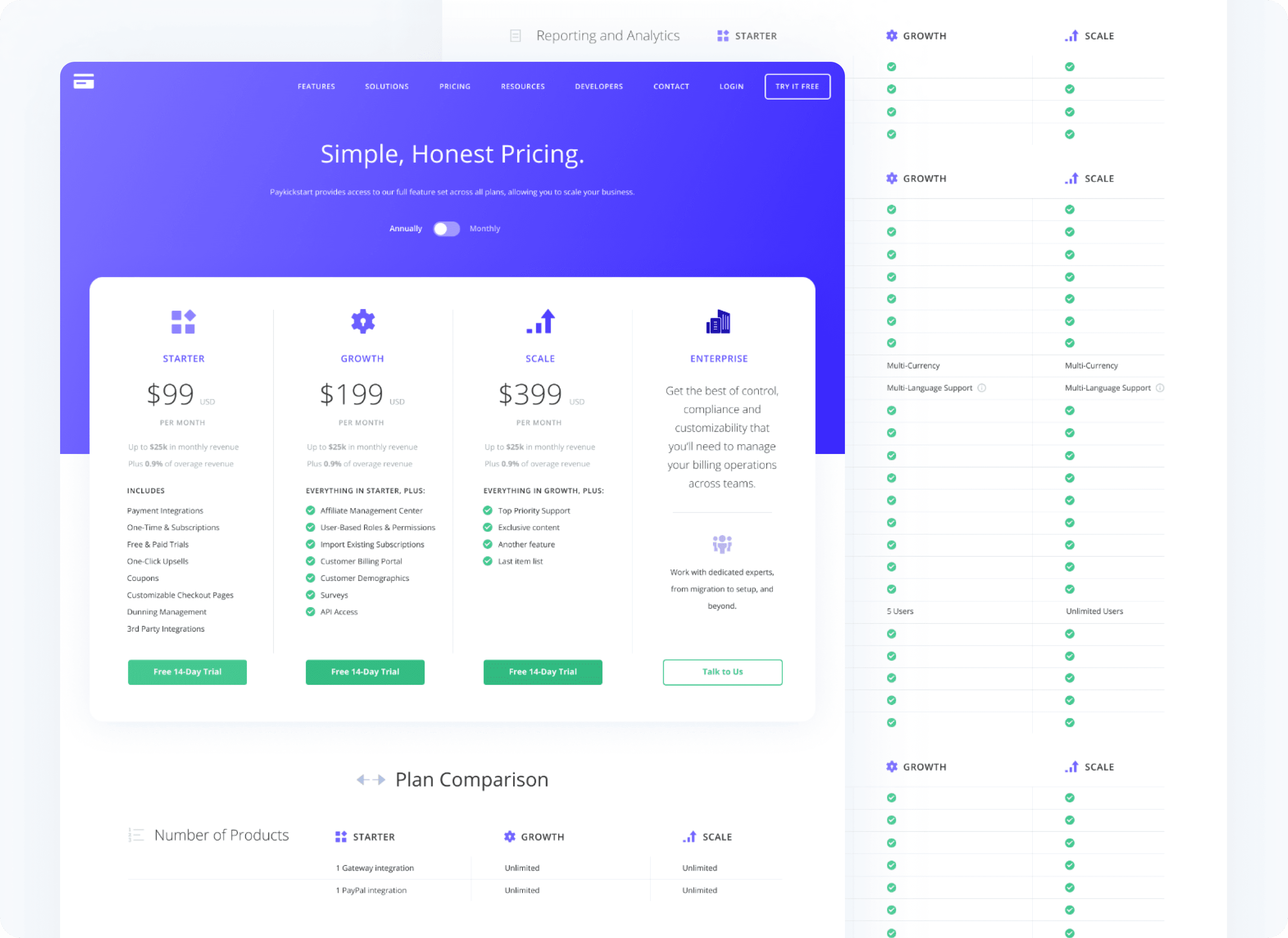
In the second phase, we applied similar design principles to the PayKickstart website. Rebuilding it from the ground up, we improved the information architecture, created clearer calls-to-action, and ensured the site was fully responsive for users accessing it across different devices.
The Results
The redesigned web app and website were met with overwhelming positivity from both the PayKickstart team and their user base. The 100+ redesigned screens helped simplify complex workflows, significantly improving user satisfaction and engagement. The client was extremely pleased with the results, and the refreshed design gave PayKickstart a competitive edge in the subscription billing and affiliate management space.
Get in touch to discuss your next design project.
View other projects in my design portfolio
